5 Charts, 60 Seconds: My Morning Apiary Triage
Most mornings, before I drive to the bee yard, I don't make my plan based on what I think I'll find. I let the data tell me which hives need me first.
The version of beekeeping where you check every colony every visit doesn't scale past five hives. With 10, 15, or 20 colonies, you have to triage — and triage gets a lot easier when your last few inspections have been logged consistently. Here's what I look at every morning, in roughly the order I look at it.
1. The triage list — what needs me today?
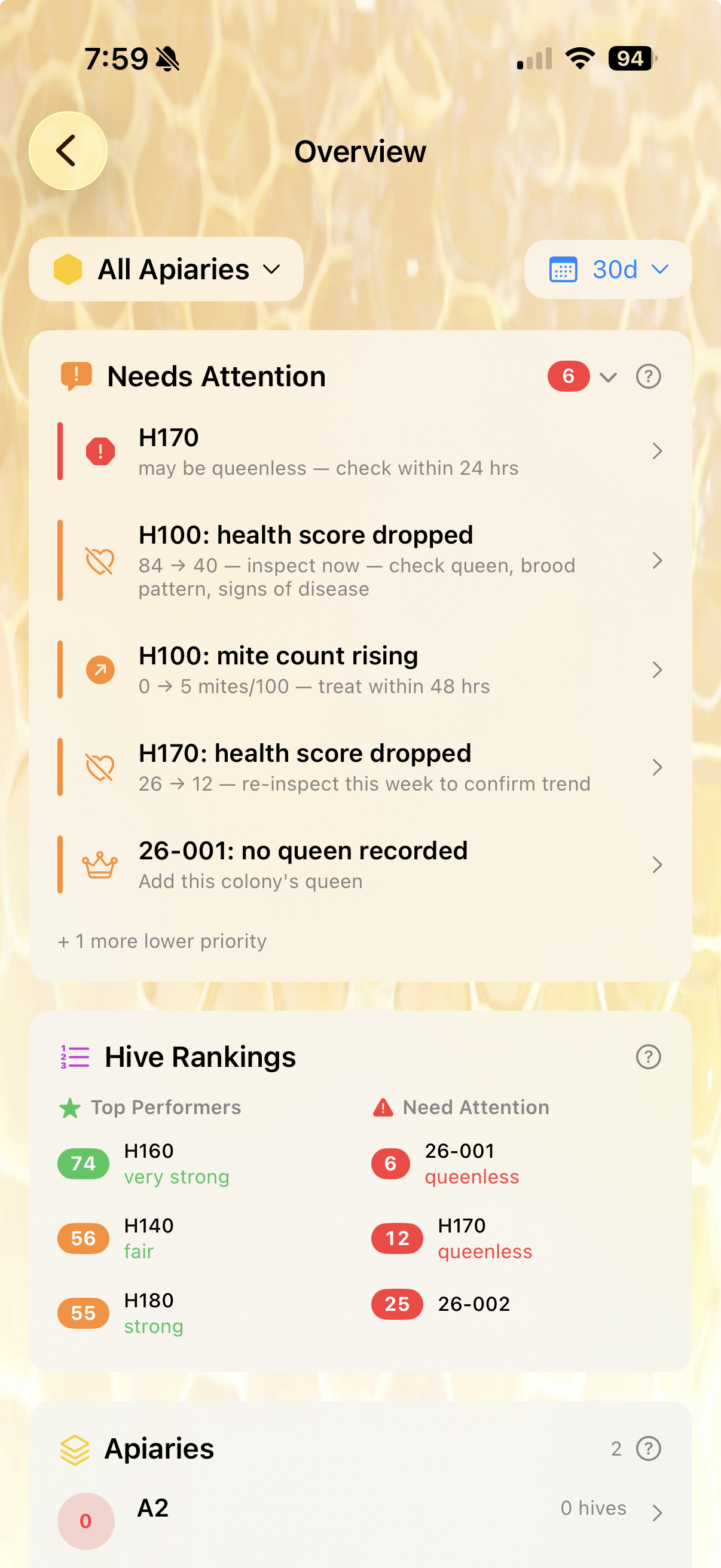
The very first thing I open is the Needs Attention panel. It merges anything urgent across all my apiaries into a single, ranked list.
What I'm scanning for, in priority order:
- Critical (red): queenless flags, mite counts at the treat threshold, confirmed disease. These get my visit today.
- High (orange): health-score drops, mite counts rising, queens missing from records. These earn a visit this week.
- Lower priority: queen aging notes, weight not logged in a while.
The line that catches my eye on this morning's list is "H100: health score dropped — 84 → 40 — inspect now, check queen, brood pattern, signs of disease." A 44-point health-score drop in one inspection isn't noise. That hive is now first on my visit list.
Underneath the alerts, the Hive Rankings card splits my colonies into top performers (H160, H140, H180) and ones that need attention (26-001, H170, 26-002). That second list is exactly where I should be spending my time — and the dashboard knows it without me having to think about it.
2. Health and varroa trends — is this hive trending the right way?
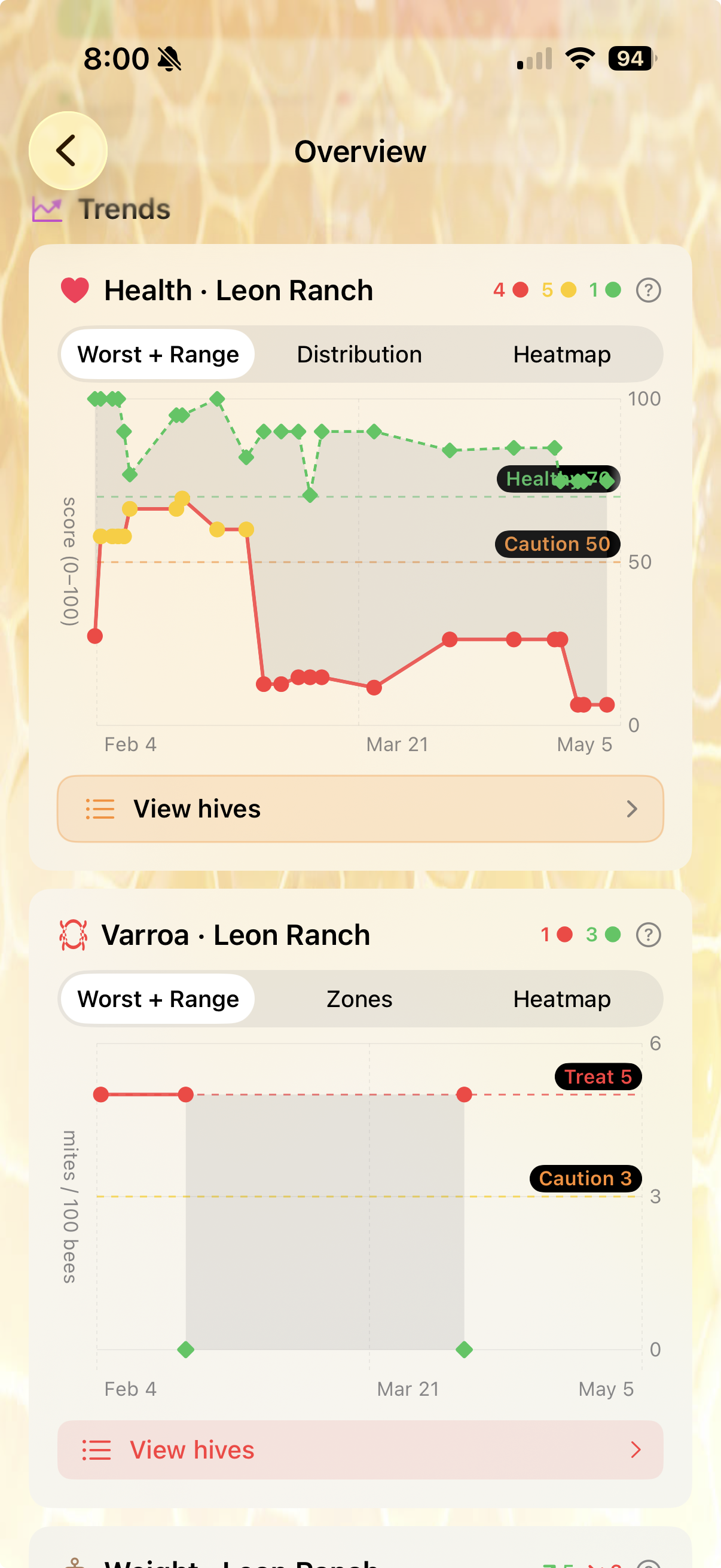
Next I scroll down to the Trends charts. The shape matters more than any single number.
The Health chart's red line is the worst-scoring hive in the apiary at each point in time. The shaded band is the spread between best and worst. When that red line stays low for weeks — like the dip starting in late February that never recovered — I know I have a chronic problem hive, not a one-off bad inspection. (That's H170, the same hive flagging "queenless" up top. The chart confirms what the alert is telling me.)
The Varroa chart shows mite load with two reference lines: caution at 3 mites/100 bees, treat at 5. Two of my hives have sat right at the treat line for 60+ days. Don't ignore a flat-red varroa line — mites that don't drop on their own usually means treatment didn't work or never happened. Time to retest and re-treat.
3. Weight and brood — colony strength signals
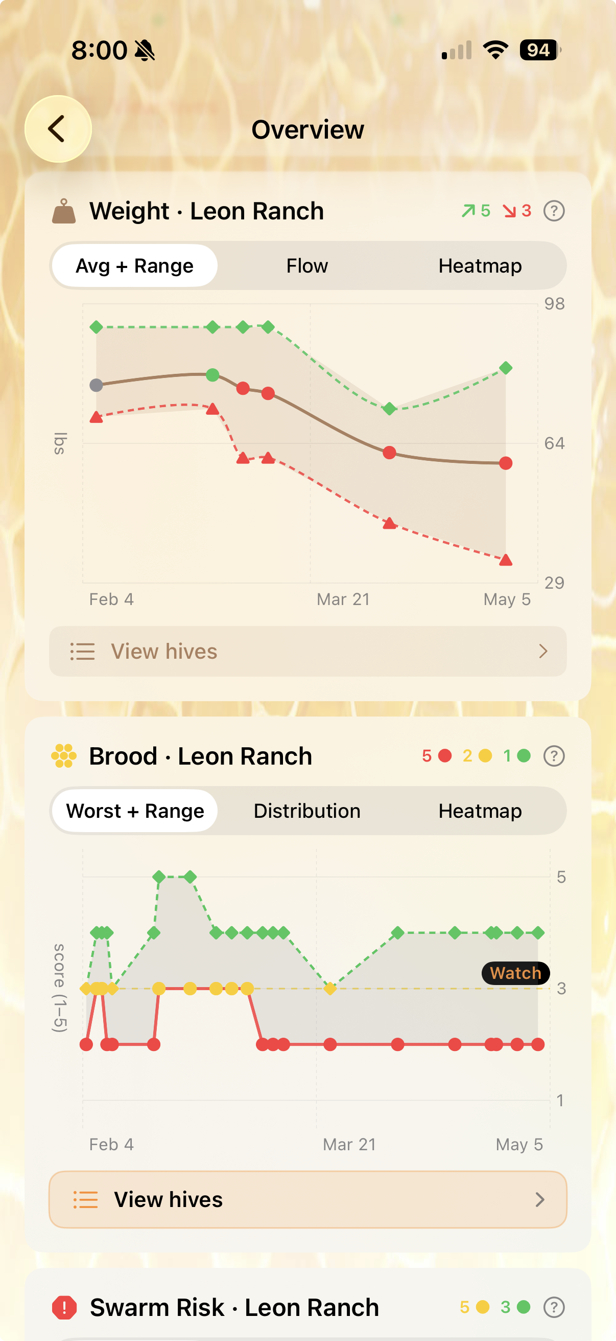
Health scores are summary numbers. Weight and brood are the inputs.
The Weight chart shows steady decline across the apiary from late February through April. Both the average (brown line) and the lightest hive (red dashed) are heading down. In summer, weight loss is bees eating stores — that's a feeding decision in my hands. In a flow, weight loss usually means swarmed, robbed, or a queen issue.
The Brood chart is more granular. Each dot is a brood-pattern score from a recent inspection (1–5 scale, with 5 being a solid wall-to-wall pattern). The red dots clustered at the bottom are inspections where the queen's pattern was spotty — gaps, scattered cells, missed sections. One spotty inspection happens. Multiple in a row is the queen telling you something. The red trend on this chart matches the red H170 line on the health chart — same colony, three different signals saying the same thing.
Three signals beats one
The reason charts beat a single inspection note: any one inspection can be wrong. A bad camera angle, a frame missed, a frustrated beekeeper. But when health, weight, and brood all point at the same hive, it's no longer a guess. Triangulation is the whole game.
4. Swarm risk and the activity log
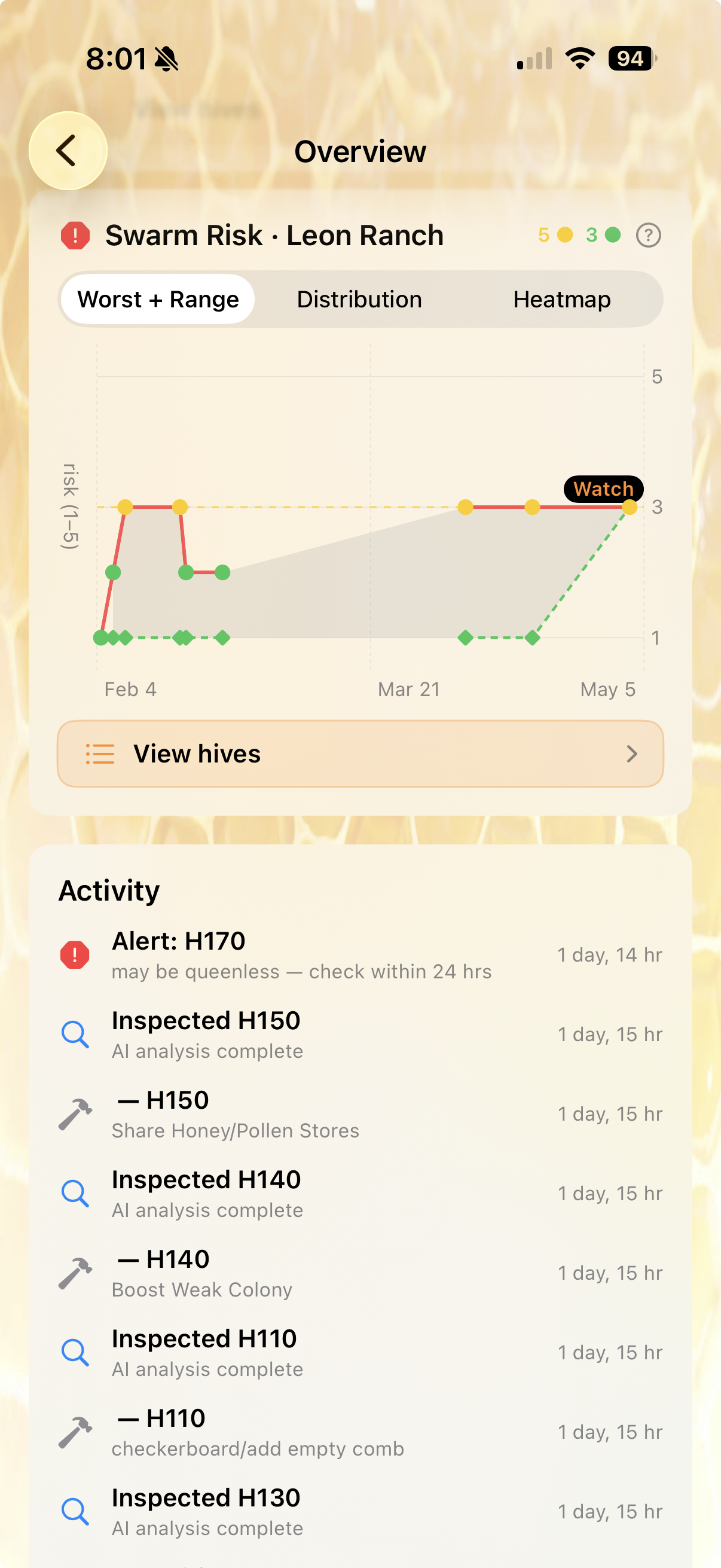
This time of year, swarm risk is its own watch list.
The Swarm Risk chart picks up signals like capped queen cells, congested brood nests, and supers near full. The yellow line at "Watch 3" is where I start adding space proactively; the red zone above it is where I open the hive today and check for swarm cells.
Below the chart is the Activity feed — what's actually been logged in the last few days. Today's feed shows the queenless alert on H170 (flagged 1 day ago), recent AI analyses for H150, H140, H110, H130, and the action items those analyses produced (share honey/pollen stores from H150; boost weak colony for H140; checkerboard/add empty comb on H110). This is my paper-trail audit. If a hive's been declining and I haven't logged anything for it, that's the gap I need to close on this visit.
5. The yard-wide view — is this one hive or the whole apiary?
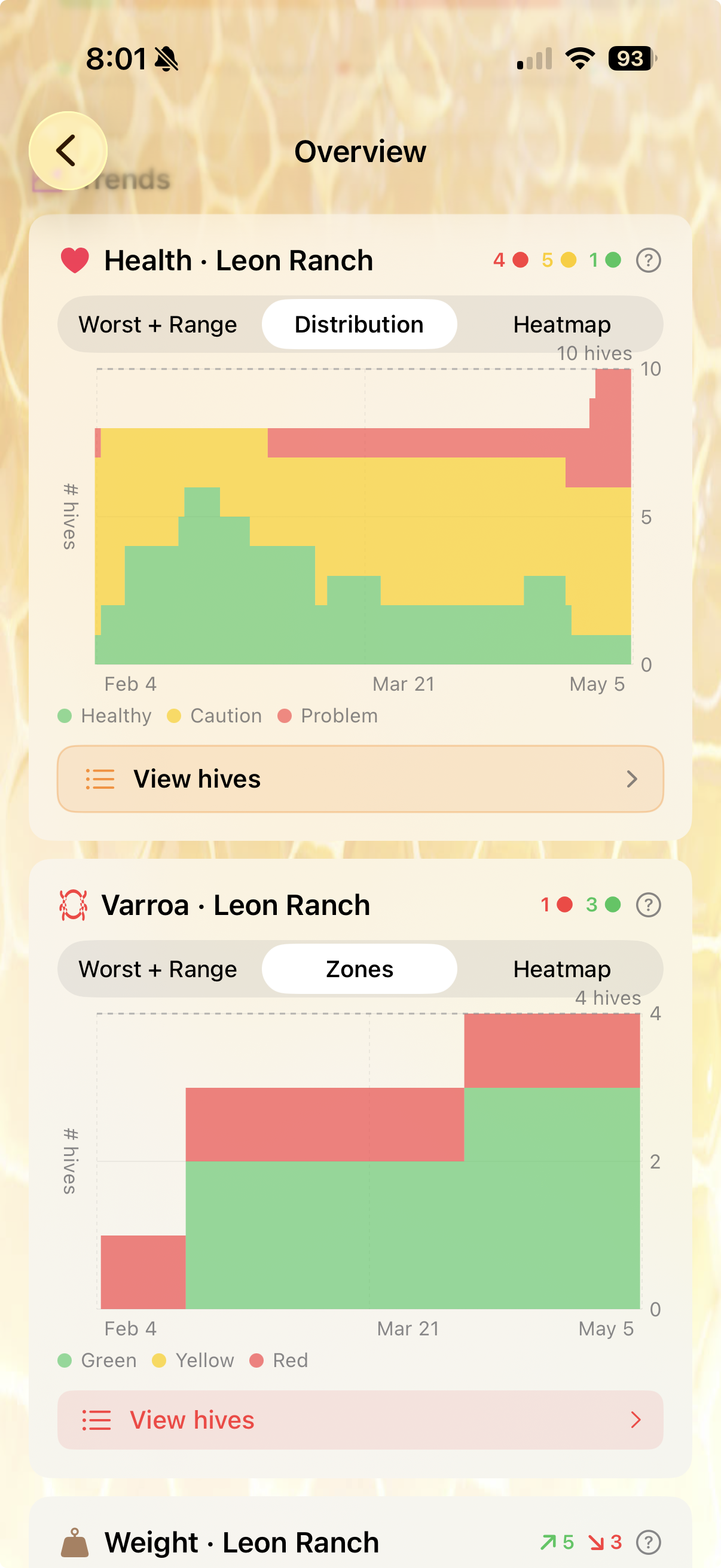
The last thing I check before driving out is the Distribution view. This answers a different question: is the problem one hive, or is the whole yard heading the wrong way?
The Health Distribution stacks how many hives are in each band — green (healthy), yellow (caution), red (problem) — week by week. Earlier this spring my green band was thicker; now the yellow is dominant and red has grown to a few hives at the top of the stack. The yard's drifting in the wrong direction overall, not just losing one hive. That changes the conversation: this isn't a one-hive intervention, it's a forage / dearth / regional pressure question.
The Varroa Zones panel below is the same idea for mite load. Green, yellow, and red counts stacked over time. If green dominates and stays dominant, my treatments are working. If red creeps up — like in the most recent column here — I have a fleet-wide problem that needs a fleet-wide response.
What 60 seconds buys me
By the time I get in the truck, I know:
- Which two hives I'm visiting first (H170 queenless, H100 health drop)
- What I'm bringing — mite testing supplies, because varroa is at the treat line on multiple hives
- What pattern I'm watching for — two hives showing both health-score drops and brood-pattern declines suggests a queen issue, not a forage issue
- What I'd already missed — the weight line has been falling for six weeks; I should have been feeding sooner
I used to do this triage with a notebook and a memory. Most mornings, I either checked the wrong hives or visited every hive and ran out of daylight. Now I let five charts do the sorting, and I save the time for the bees.
Five charts. Ten hives. Sixty seconds.
BeeKeeperVoice gives you these dashboards out of the box — every inspection you log feeds the trends automatically, so triage gets faster the more you use it. Free for a full month.
Download on App Store